Storyboarding AR
Storyboards are a fundamental tool through the entire creation of a AR campaign.

Client Pitch or Brief
The first role of a storyboard is to either pitch an idea to a client or the other way aroud: a client is sharing their idea with our creation team. More often, the storyboard starts with a list of references and quick sketches that are shared and created during the first meetings with the client in order to discuss new ideas, technologies and budget constrains. Everything get’s much easier once everybody have something to look at instead of waving your arms during a zoom call!
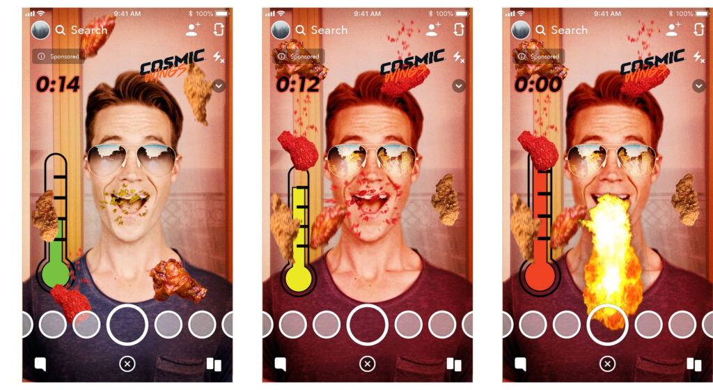
(Cosmic Wings – Game)
The Cosmic Wings project was an itteration of the now “classic” food eating game – where the user must “eat” falling food. In order to “spice it up”, I came up with the idea of adding a thermometer and the goal of the game was to get as many of the “hot” wings until you reach “extreme hotness” and breathe fire from your mouth. Added some Ray-Bans not only because they look cool (or hot in this case), but to make highlight the fire effect by adding the flames reflect on the shades. These little details is what make a lens pop-up.

Asset Creation
Once the storyboard is approved by the client it is used for creating all the components that are going to be used in the final Lens. Often the 2D components are picked directly from the storyboard and adapted to the AR platform of choice
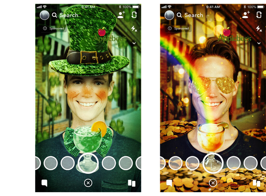
(Applebees – Saintly Sips )
For this Lens it was important to communicate with the client in order to get the best possible assets for the final lens – in this case some high quality pictures of the cocktails that were being advertised. Using photoshop I made them transparent and cleaned up before importing to Lens Studio and Spark, but decided to model the had and glasses instead. This required some extra work, and recreating the sparkling textures for the top hat was a bit challenging, but in the end we ended with an amazing campaign and Applebee’s would call for more lenses many times after.
Applebee’s
Saintly Sips
Interaction Design and Problem Solving
Gamefied lenses are some of the most challenging ones, because not only the visuals must be exciting and on brand, but the more the user can do, more things can go wrong. The best way to avoid complex (and expensive) reworks is by creating very detailed storyboards where the entire user flow is described in a way that both the client and the development team can be sure that we are all in the right direction.
(Jacks – Dipping Game )
This lens required many storyboards and some back and forth but this process was fast thanks to being able to quickly add variations to the original storyboard. The visuals and disposition of all elements of the game where approved very early on, but in order to figure out the bes and most engaging UX it was required to dive into several interaction alterantives. The goal was to throw the chicken nugget into the dips, but the original idea of simply “swipping” up to throw had to be change, as this action was also responsible for closing the app on Iphones, thus it was decided to change it to a power meter. The idea of the power meter came from old Golfing games, where the arrow would move up and down and the user had to time the right moment to push the ball – or the chicken nugget.

Interaction Design and Problem Solvin
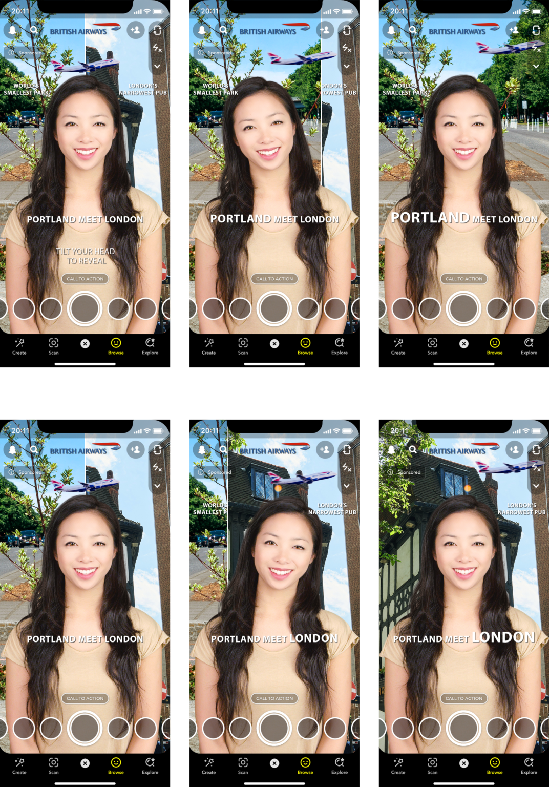
(British Airways – Portland meet London )
Here’s another example of using the storyboard to detect future issues. The original brief described using head tilting left or right to select one of the British Airways destinations. Once selected, the screen would pan revealing a new background. But after a close look at the storyboard we realized that it wasn’t clear if the pan reveal should follow the head movement or the flying airplane animation. It was decided that each direction should have it’s own animation, as well as using the typography to make clear which destination was selected. Clear user feedback is key for an effective interactive lens. There should be no doubt of “what” or “why” something just happened on screen.
Sketches and Concepts
Besides Storyboards, I really enjoy making sketches and concepts. They are created before the storyboard, in order to visualize some specific idea, or even during the development, in order to quickly test new ideas and directions for a lens. For this Panera lens the quick drawing were key to coming up with a way of selling the idea of eating hot chesse soup during the summer! Usually the most outrageous client demands becomes the best (and funniest) lenses. After a single look to the simple “cheese bread swimming pool” everybody would chuckle and smile – which proved I was the right direction.
Another tool for sketching is to generate some high-end fully rendered scenes. These are important to demonstrate the final quality that we are aiming for the idea that, until now, was just a black and white sketch. I quickly modeled and texture the swimming pool flamingo, not worrying too much about optimizing it for the actual AR lens. This allowed the client to quickly approve the concept and development could run smoothly from there on.