Essilor -Showcasing Bifocal Lenses in VR
Immersive Bifocal Lens Demonstration Tool
About
Essilor, a French multinational that controls almost half of the world’s prescription lens business, hired MJV Innovations to research a better way to show customers the benefits of its prime line of bifocal lenses. The just-released Google Cardboard could be an affordable solution, but nobody in the team had experience in the new area of VR development.
My consultancy company, Imaginaria, was hired to assess the technology’s feasibility. The client feared VR to be too complex, but at our first meeting, I demonstrated that it could be done by presenting a working prototype I developed the day before.
I was immediately hired as a full-time employee by MJV and was assigned a team to develop “Essilor – Experience More”.
UX Challenges
My role was to lead best practices in Immersive UX and UI, as well as creating assets alongside a programmer and a project manager. We had only one month to present a working software.
MJV’s team briefed me on their initial research on eyewear retail. They had already created a deck with the situations they wanted to simulate in VR, and I had to use my VR experience to apply the best UX and UI solutions.
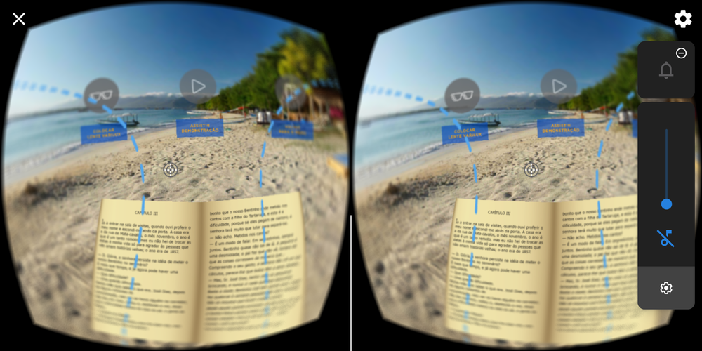
SIMULATING WEARING BIFOCALS…IN VENICE
The experience would have three scenarios designed to showcase a feature of the bifocal lenses. For this I had to simulate several visual distortions, subtle lighting conditions and readability tests that worked with current generation mobile screens.
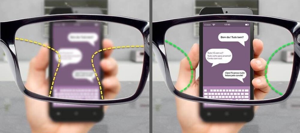
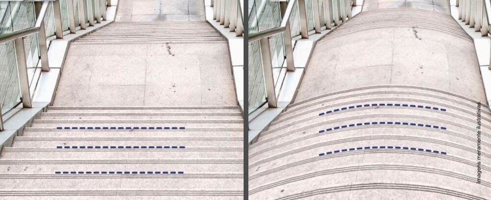
ONBOARDING
In 2016, most people had never used VR before, so I had to come up with detailed orientations and straightforward UX/UI solutions.
THIS IS THE EXCITING PART OF WORKING WITH UX FOR VR: I FELT LIKE TEACHING USERS HOW TO USE A MOUSE IN THE EARLY DAYS OF PERSONAL COMPUTING.
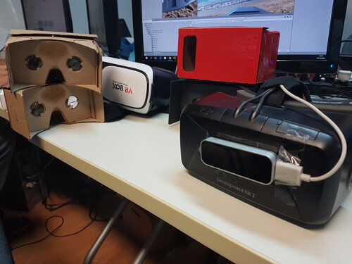
We were onboarding the user not only to our App but to a whole new media. For this we decided to go the extra mile and added detailed instructions and even an animated videos showing how to assemble a cardboard, how to use your cell phone and basic operations. Nothing should be taken for granted.
UX Solutions
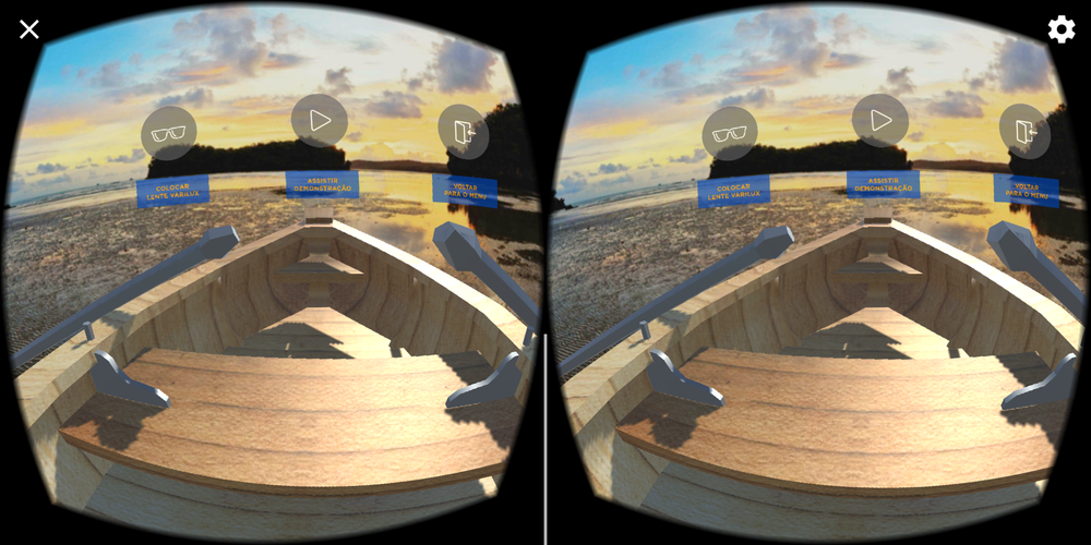
For the VR UI itself, I decided to use gaze control and work out to remove any ambiguity from the UI. Being able to move your head freely creates challenges for the designer, so several layers of affordances were created to guide the experience:
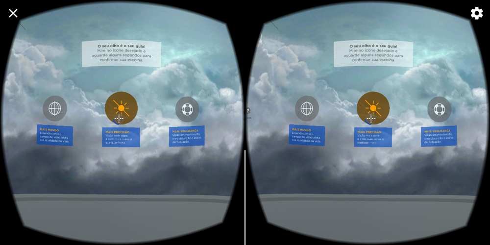
Spatial affordances and UI strategies for 360 interfaces
TIMED GAZED CONTROLLED BUTTONS – TO AVOID UNREQUESTED BUTTON ACTIVATION
COLOR CODING AND SCREEN BRIGHTNESS CONTROL – TO INDICATE WHAT IS ACTIVATED AND IF THE SCENE IS INTERACTIVE OR NOT AT THAT MOMENT.
360 DEGREE GUIDES – TO REMIND WHERE’S “FORWARD” WHEN FACING AWAY FROM THE FOCUS AREA.
CLEAR TEXT PROMPTS – TEXT PROMPTS WOULD ENSURE ACTIONS ON SCREEN.
LINEAR PROGRESSION – EVERY ACTION WOULD LEAD TO A SINGLE SCENE PLAYING OUT.
CANCELING-STOP COMMAND – ALL SCENES COULD BE STOPPED AND RESTARTED – CRUCIAL IN A RETAIL EXPERIENCE.
MULTILAYERED FEEDBACK FOR EVERY ACTION – SOUND, COLOR, MOTION.
VR DEVELOPMENT – (still) UNCHARTED TERRITORY
With my early VR demo and MJV’s guidelines in hand, we started development using the UNITY game engine.
We used a lean iterative design approach, aiming to deliver a horizontal slice as fast as possible. Timing in VR and in a retail environment is of the essence, so figuring out how long the experience would take was our first goal.
Every design decision was new. Should there be a floor on the main menu? How high should the buttons be? Should there be anything behind the user? How does transparency translate to a 3D environment? How big should the copy be? There were no guidelines and we had to learn by constant user testing.

CONCLUSIONS
The final VR experience was successfully presented to Essilor, who requested an additional IOS version.
Working on this project for a significant client demanded me not only to prove the feasibility but also to constantly manage the clients and the team’s expectations. It was very exciting to make a new technology accessible while exploring uncharted UX territory.
